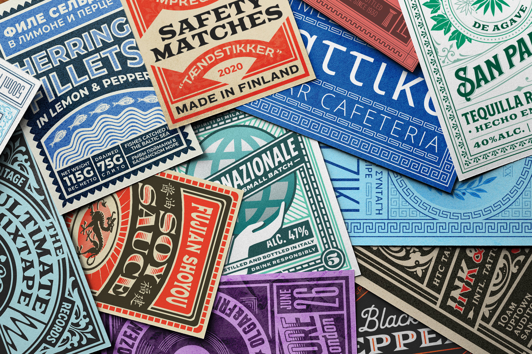
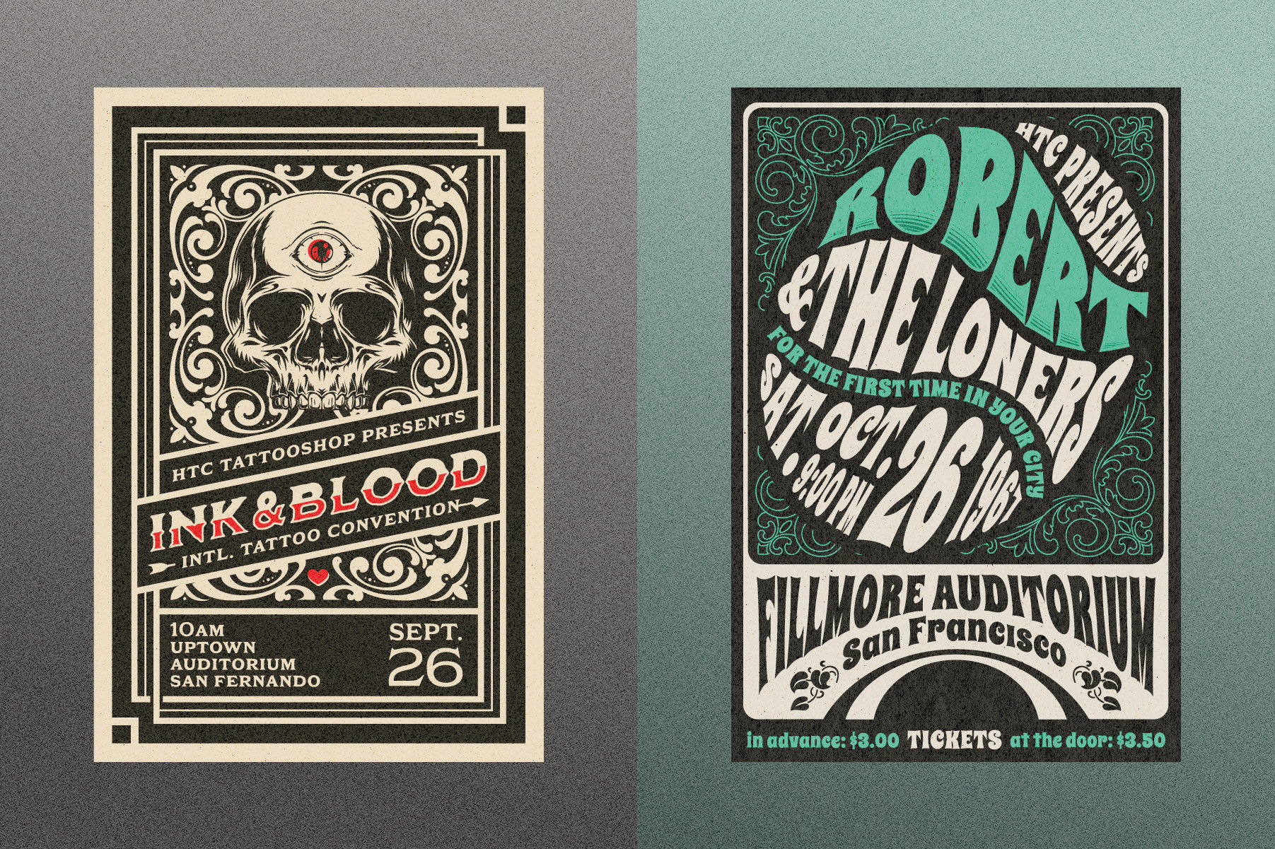
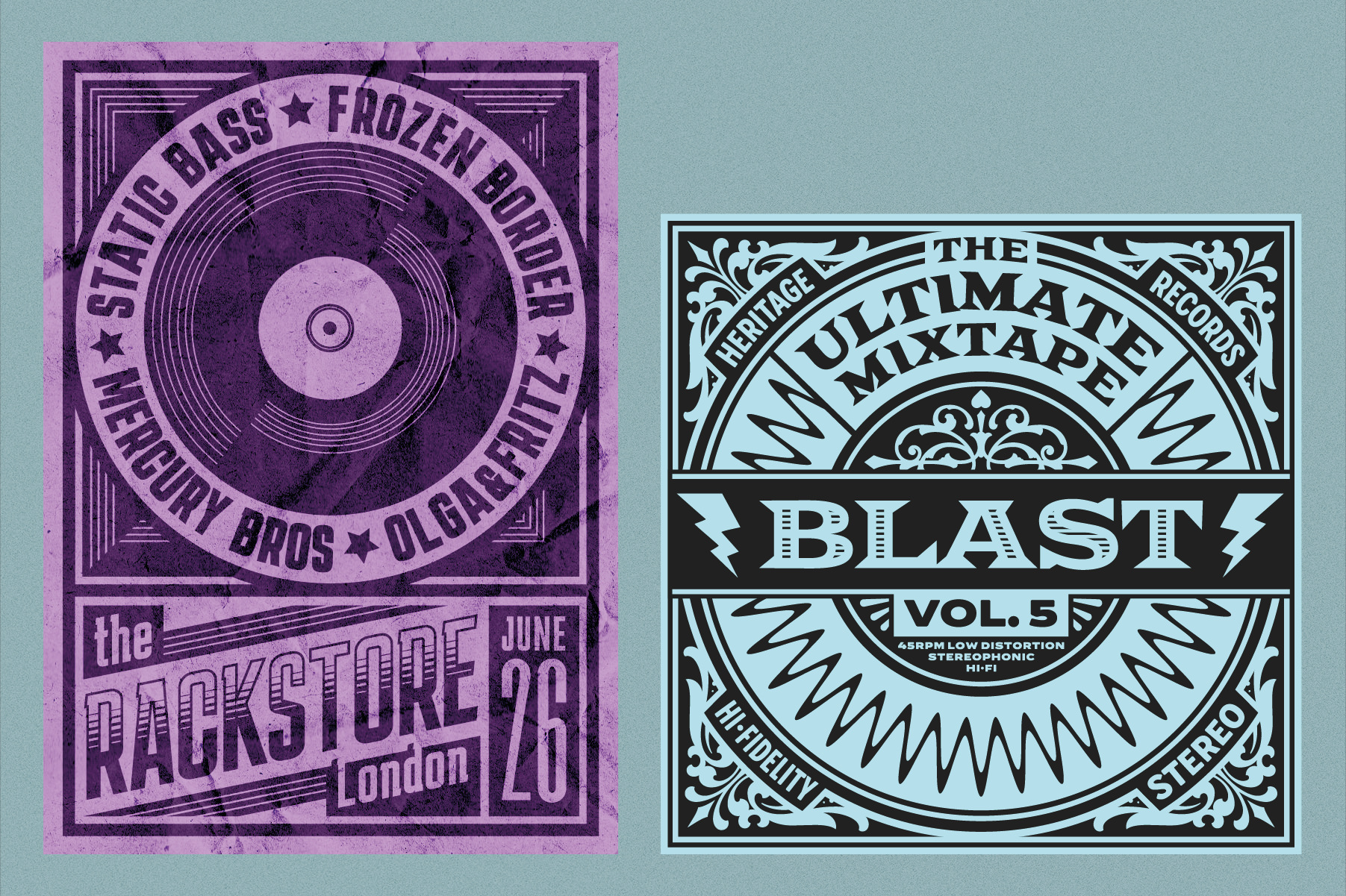
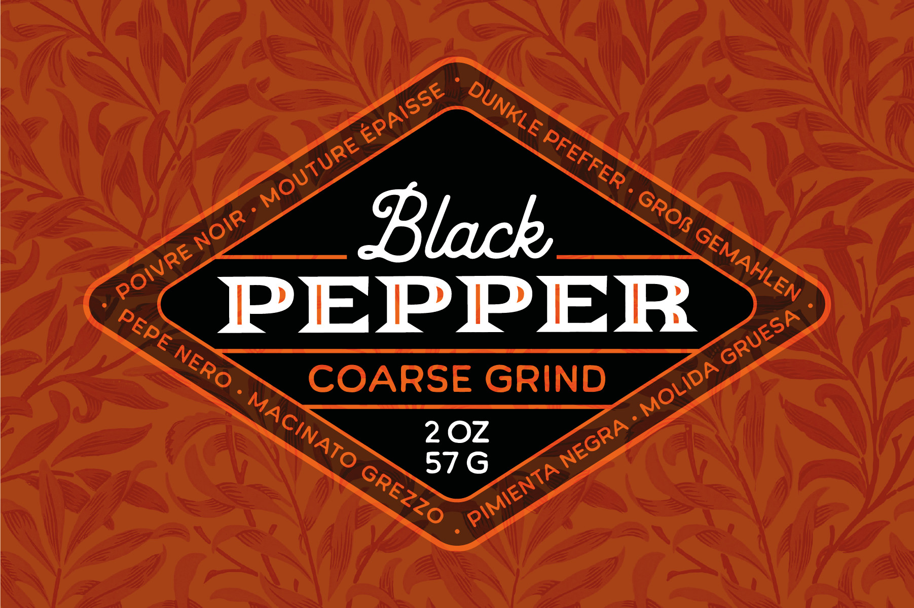
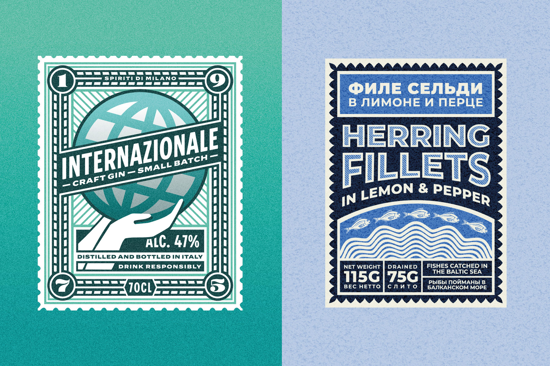
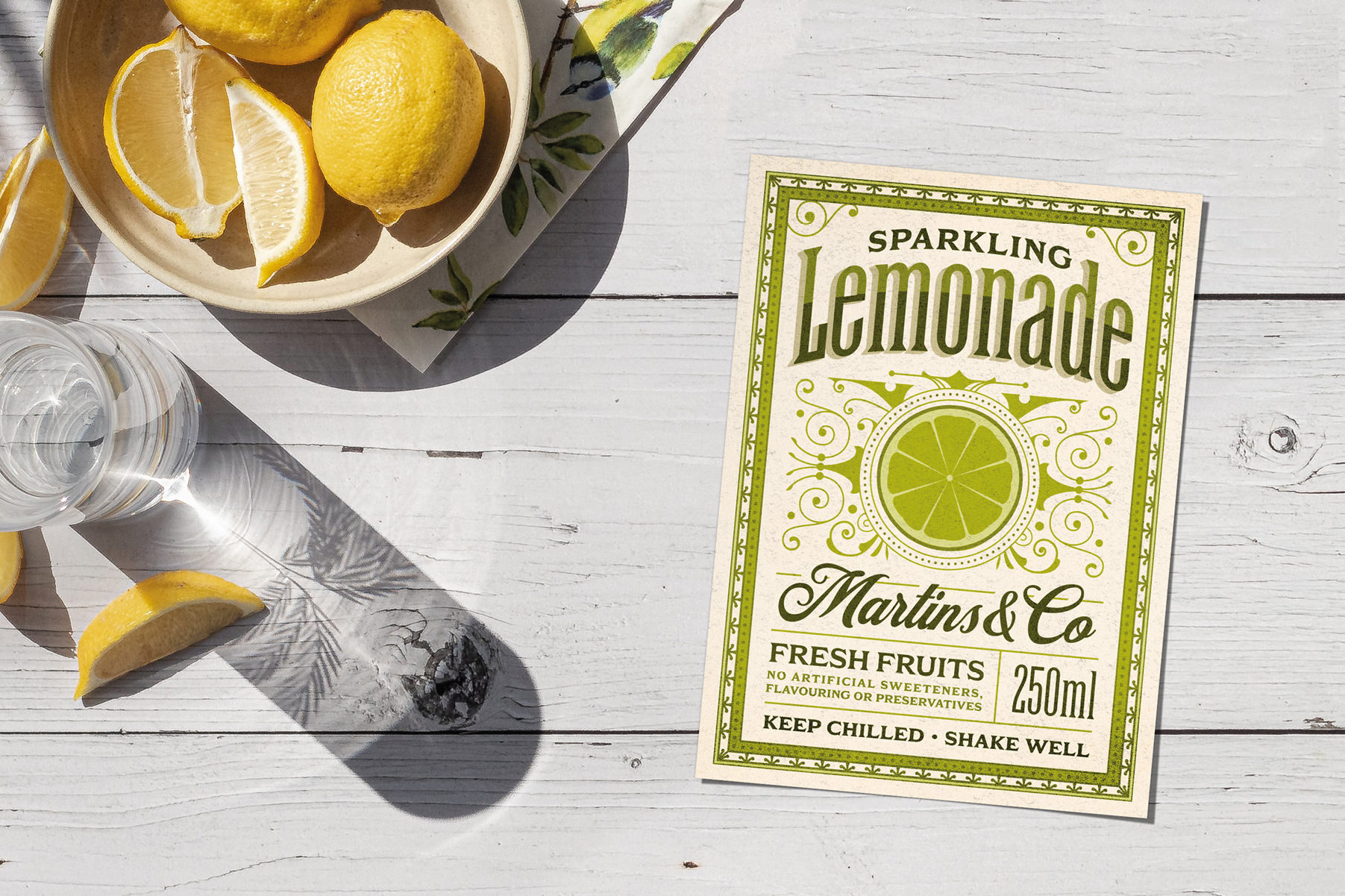
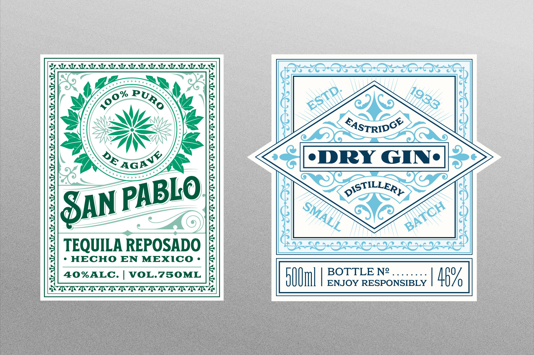
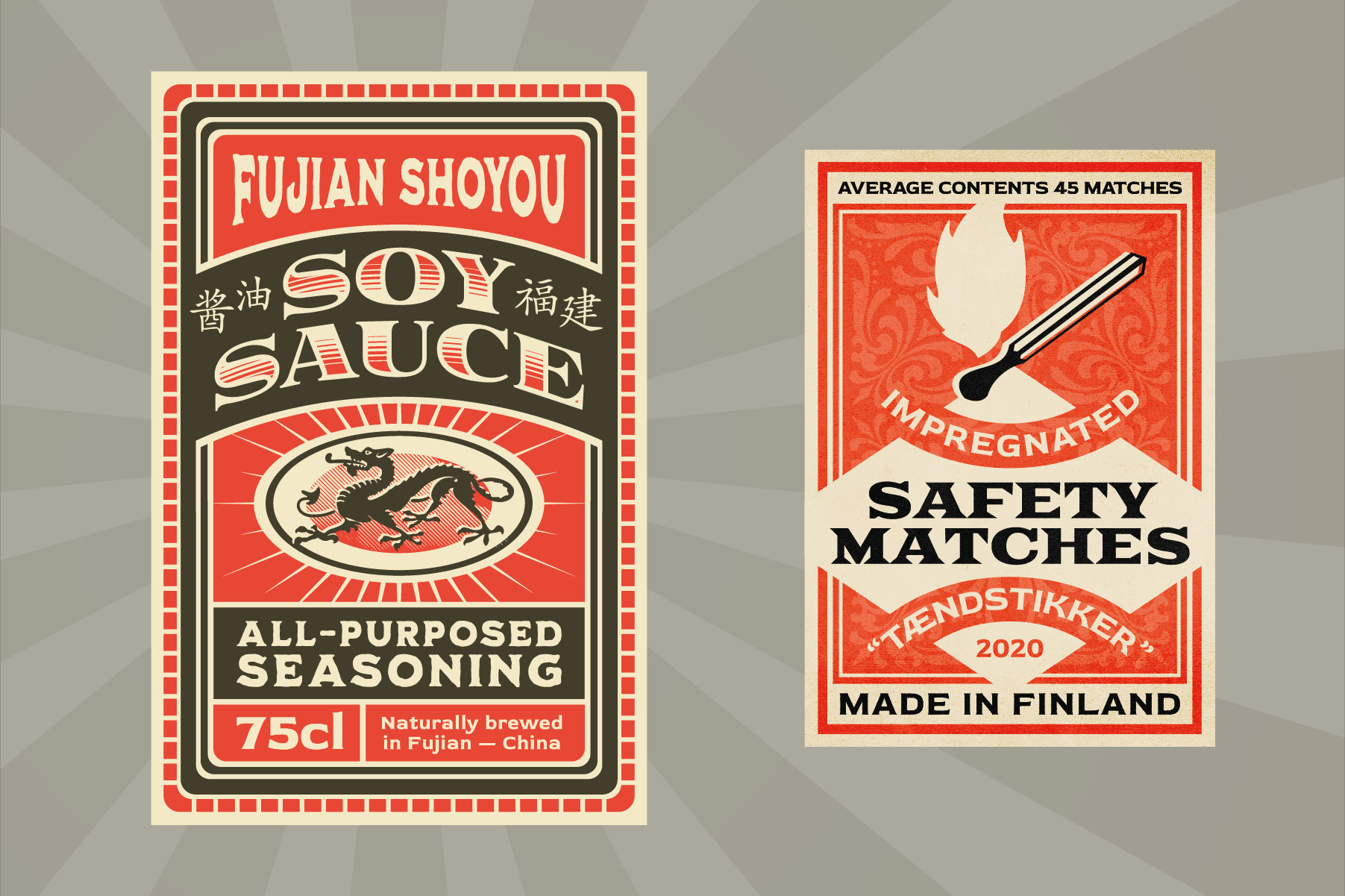
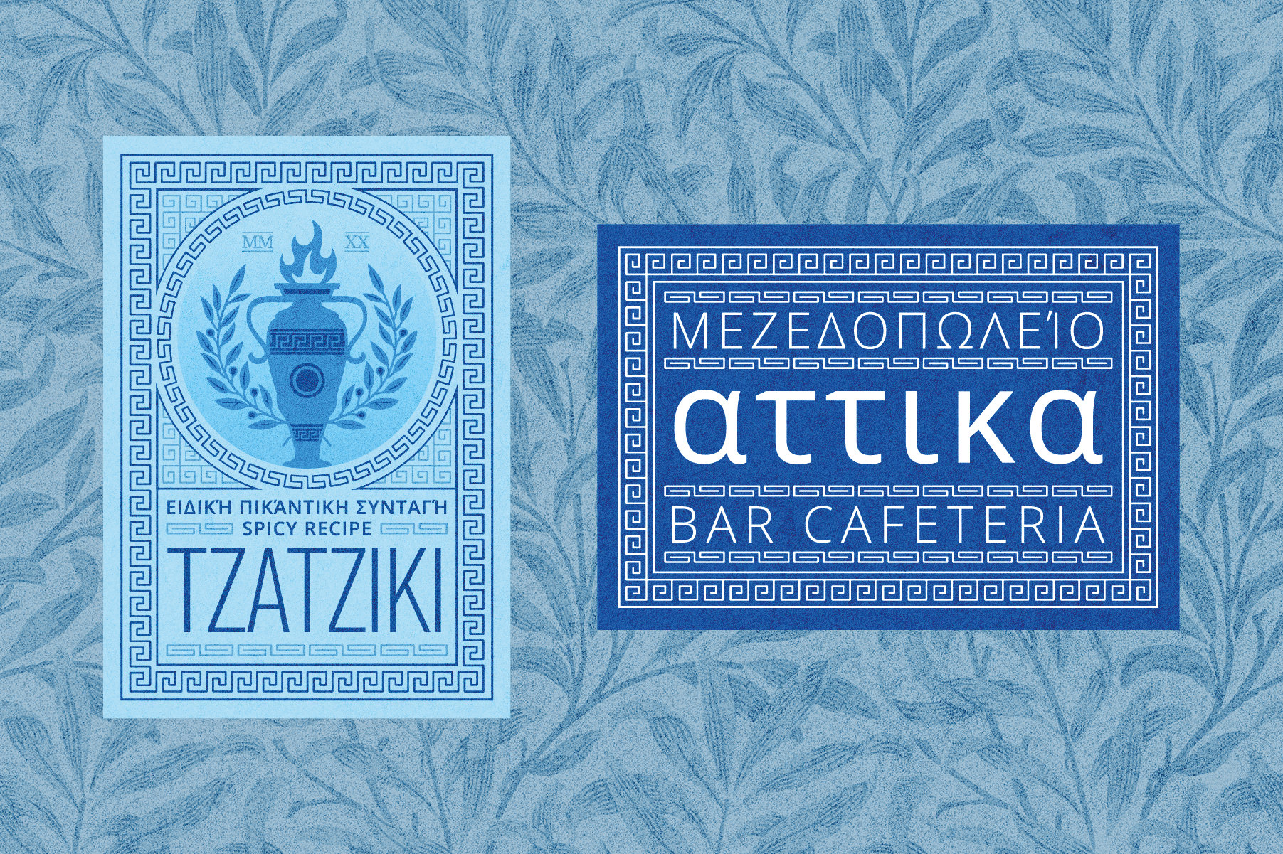
Kittl Templates
Posters and labels
Kittl is an online design app for which I designed a few fonts as well as these templates, 100% editable on the app.
Fictive names and infos only. You can try them for free and find more on my profile page.
Most ornaments are not drawn from scratch but carefully composed using elements and basic shapes from Kittl's library.
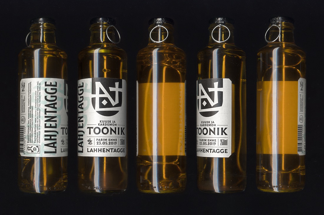
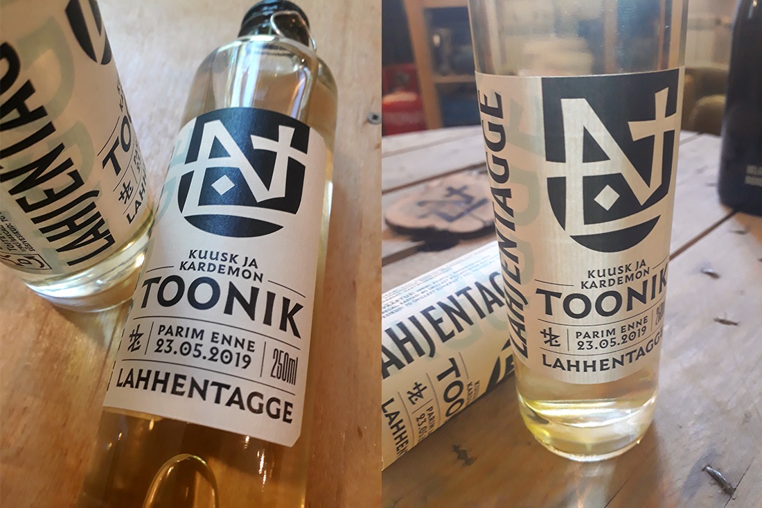
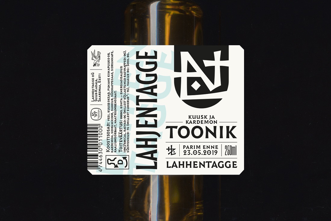
Lahhentagge tonic water
Bottle packaging
Bottle designed for a herb-flavoured tonic water made by the estonian distillery Lahhentagge to fit their gin bottle.
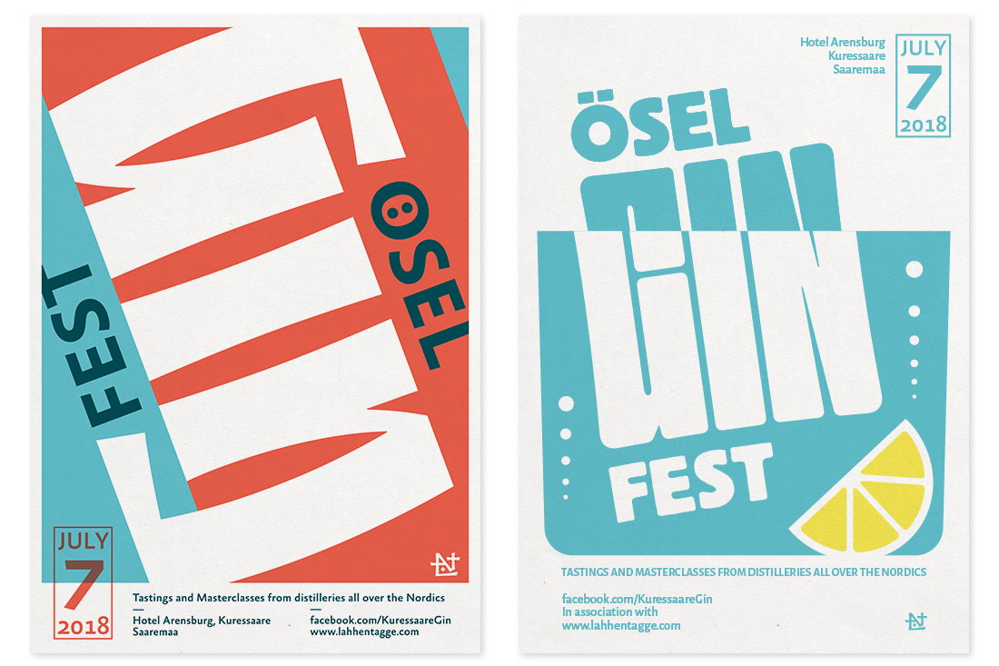
Ösel Gin Fest
Poster
Two proposals for the first Gin festival hosted by Lahhentagge Distillery in Saaremaa, Estonia.
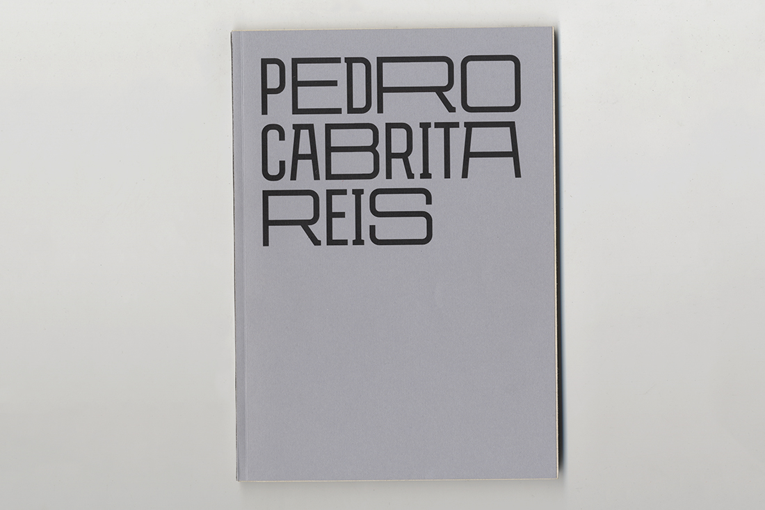
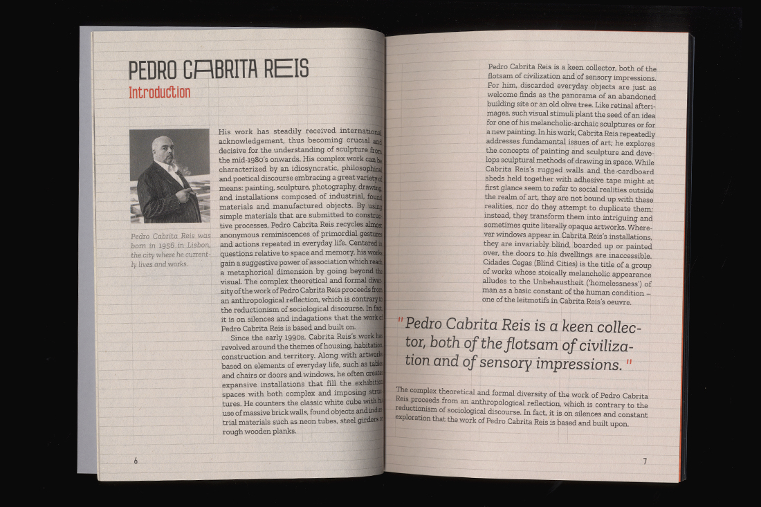
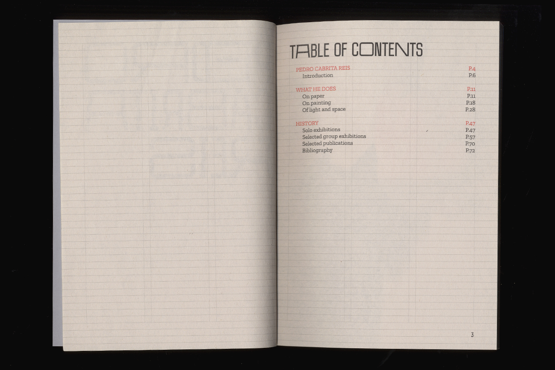
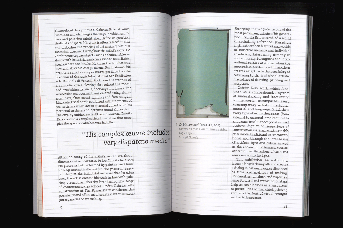
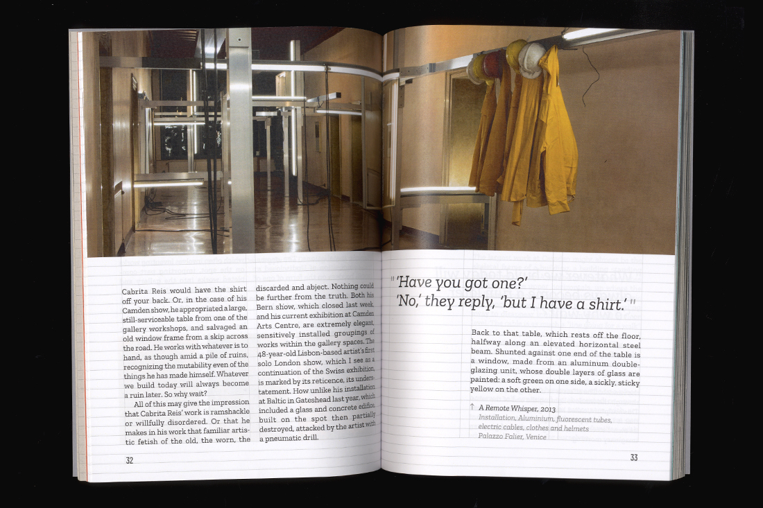
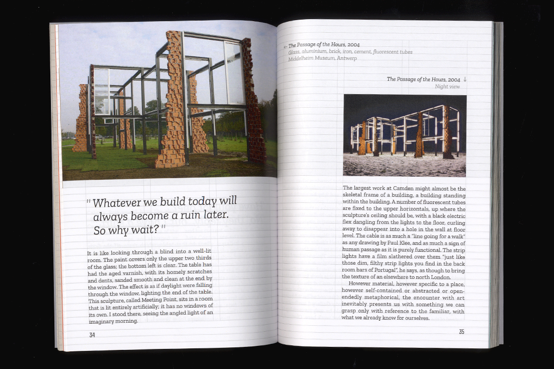
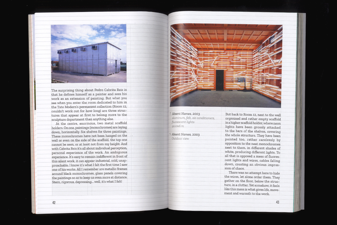
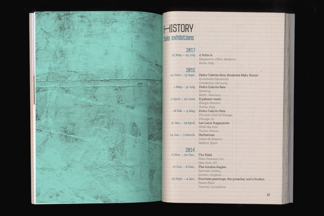
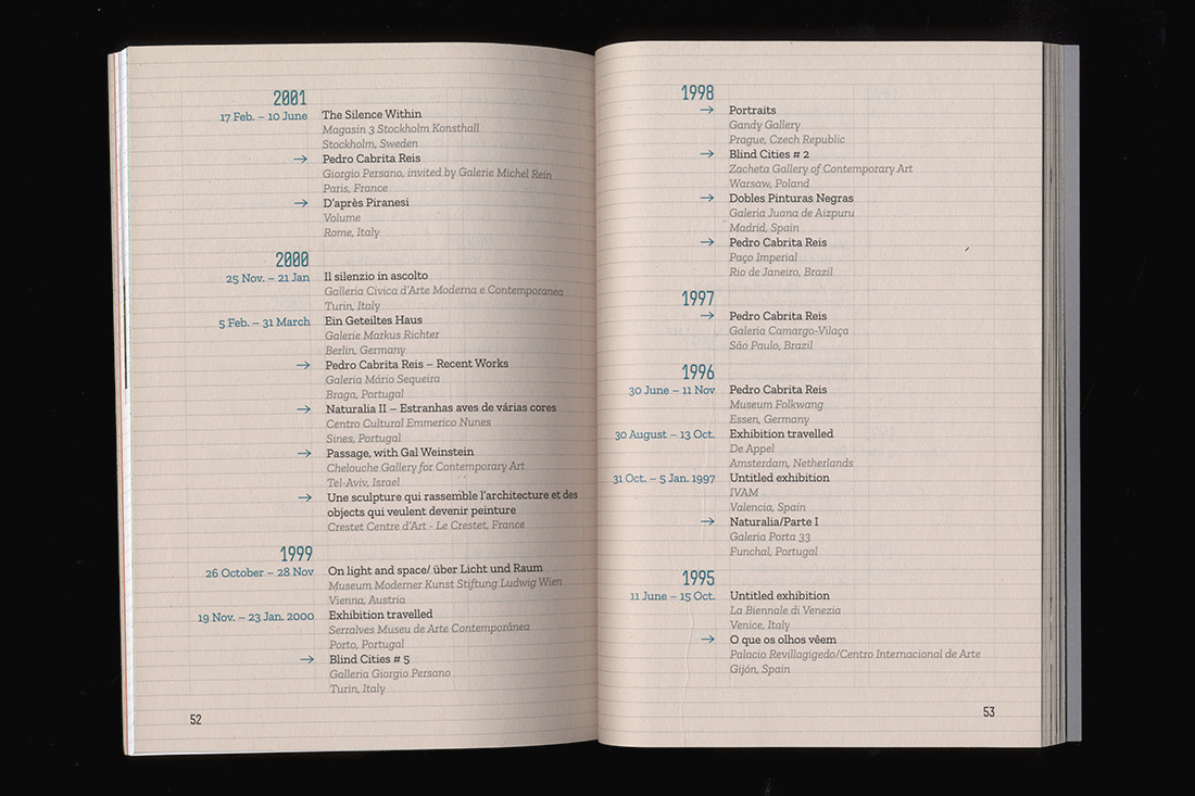
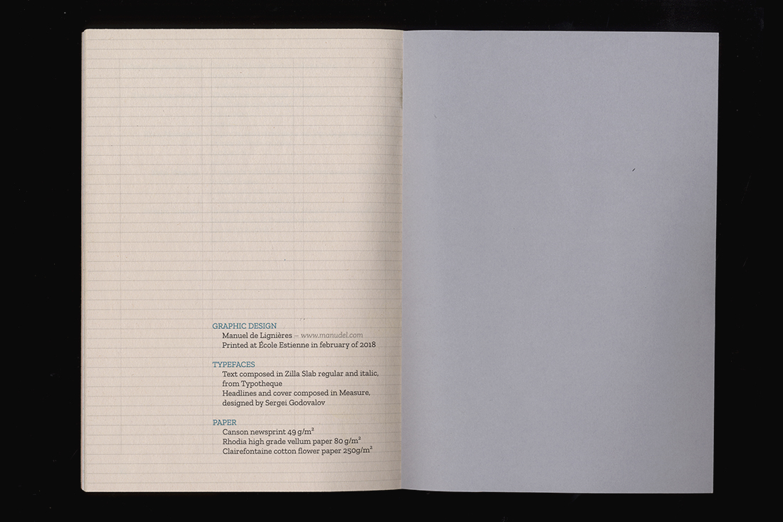
Pedro Cabrita Reis
Book design
A ninety-four pages monograph about the Portuguese artist Pedro Cabrita Reis.
Handbound prototype printed on two different papers, using the typefaces Zilla Slab, from Typotheque, and Measure, from Sergei Godovalov.
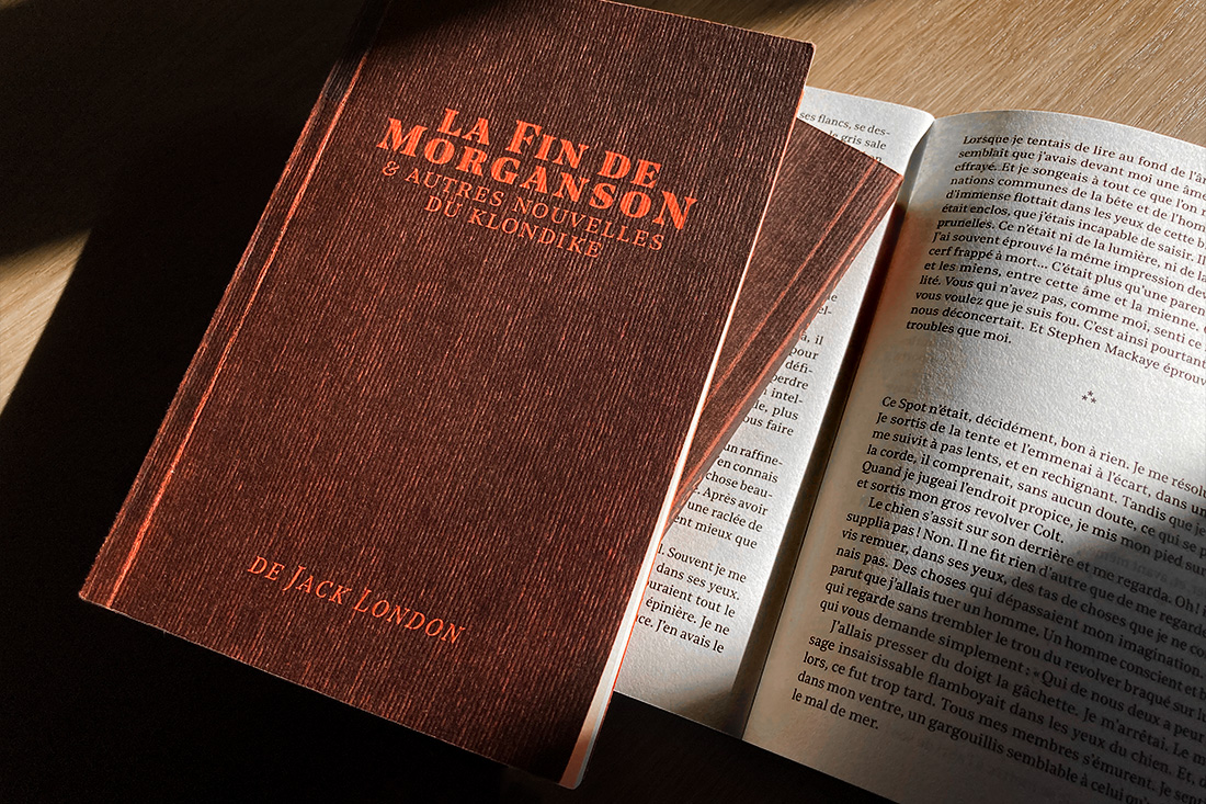
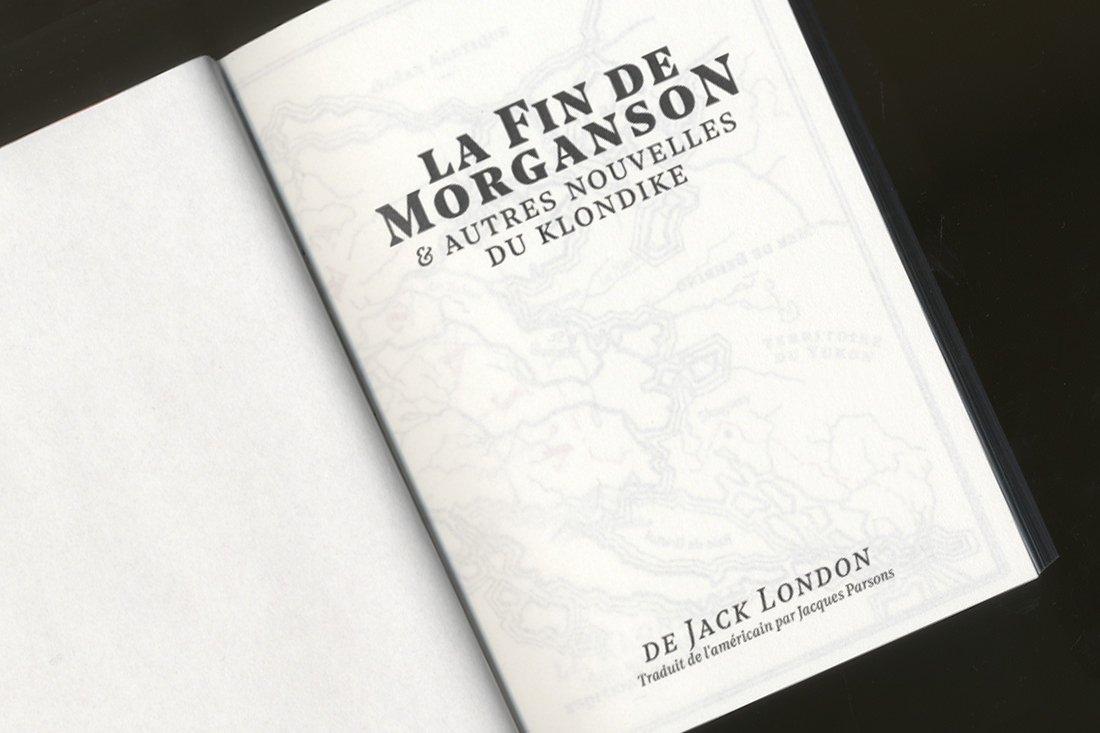
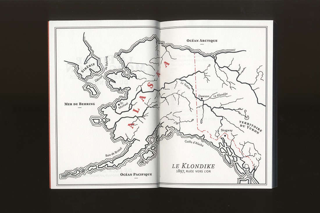
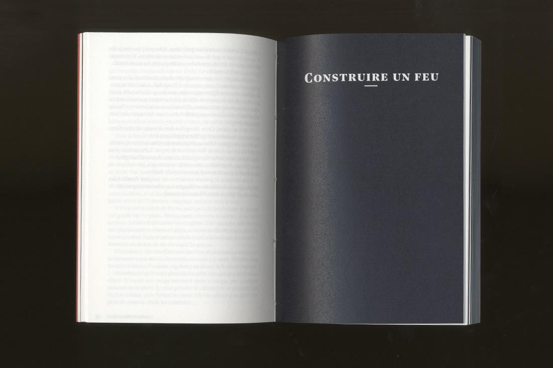
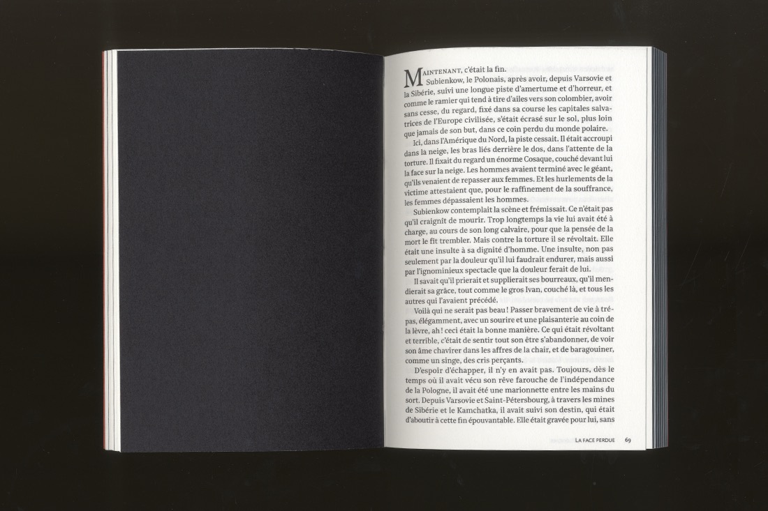
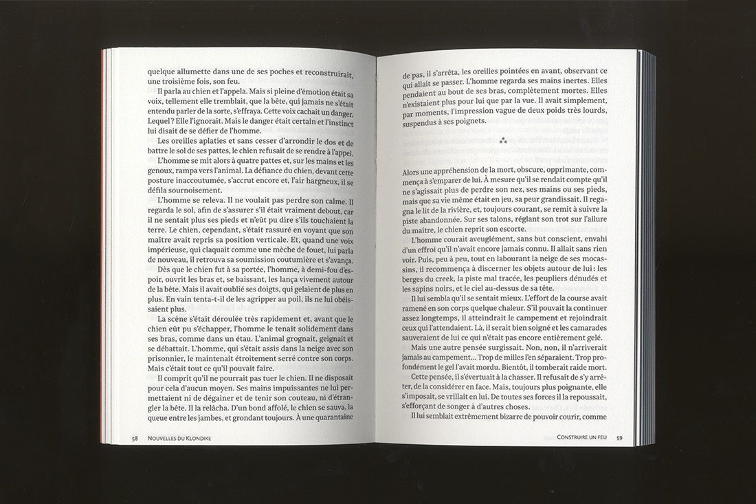
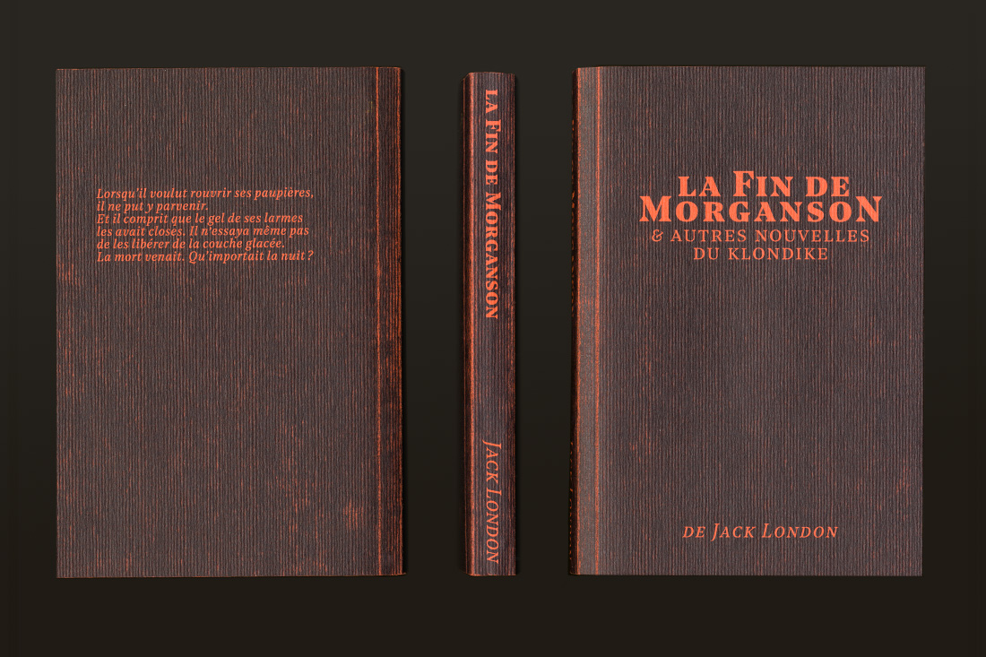
La fin de Morganson
Book design
Collection of stories by Jack London – Handbound prototype.
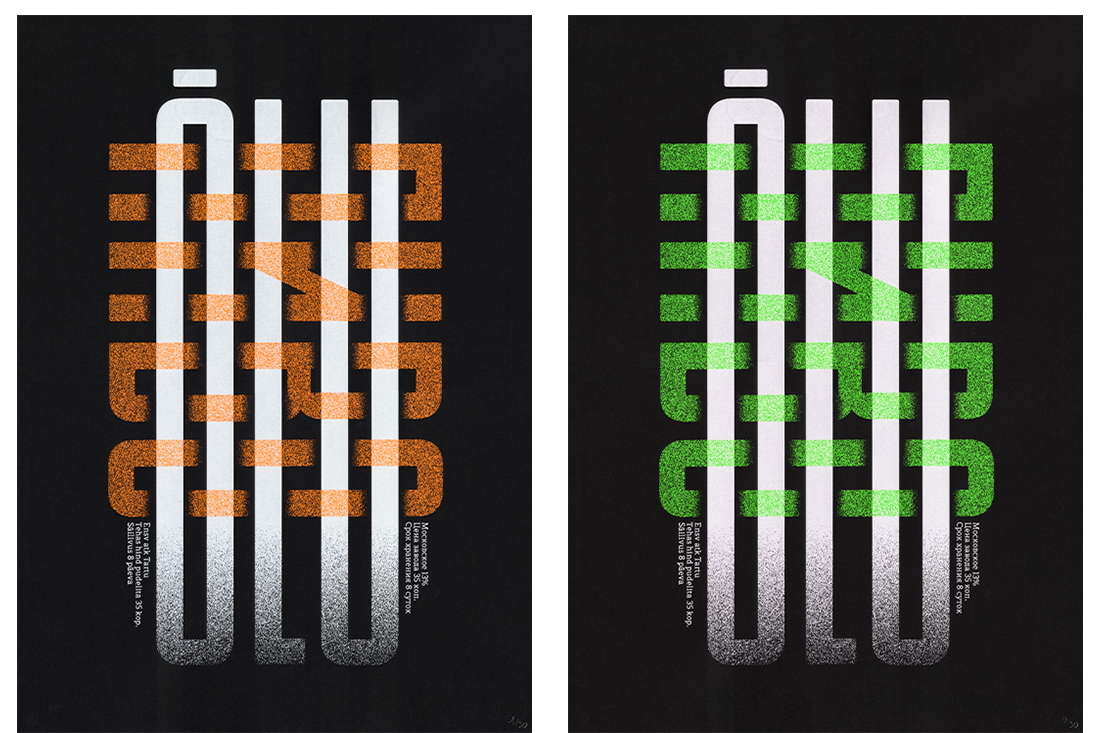
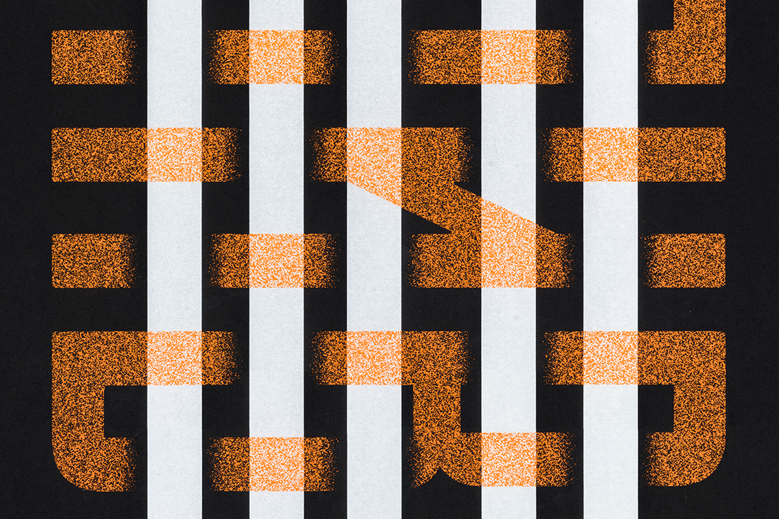
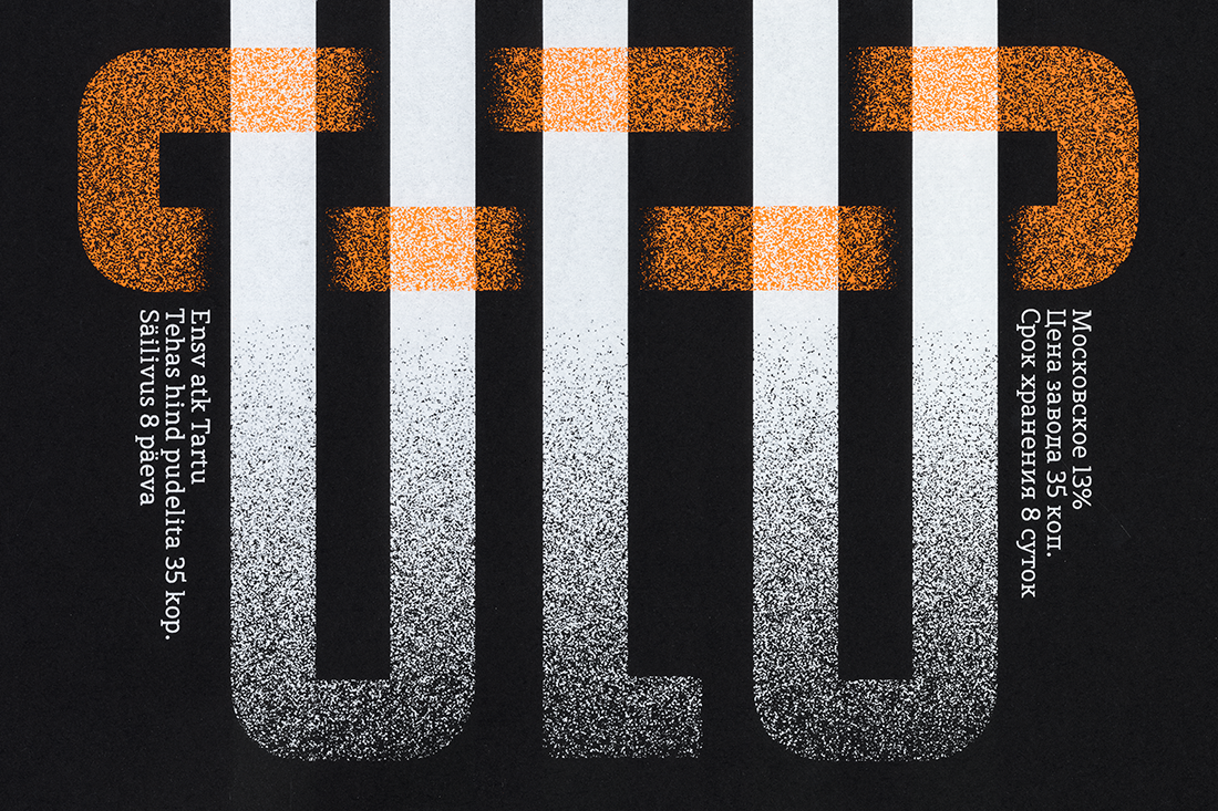
Õlu / Пиво
Poster
A screen printed poster featuring Voolik Nord and Bröd Slab, mixing Estonian and Russian languages.
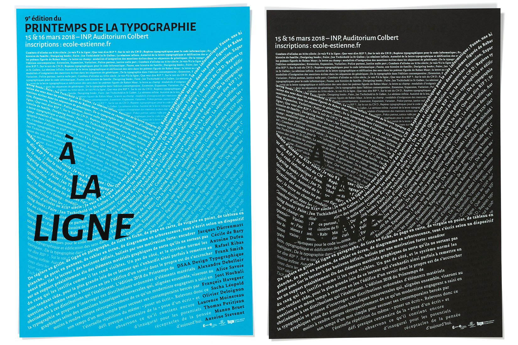
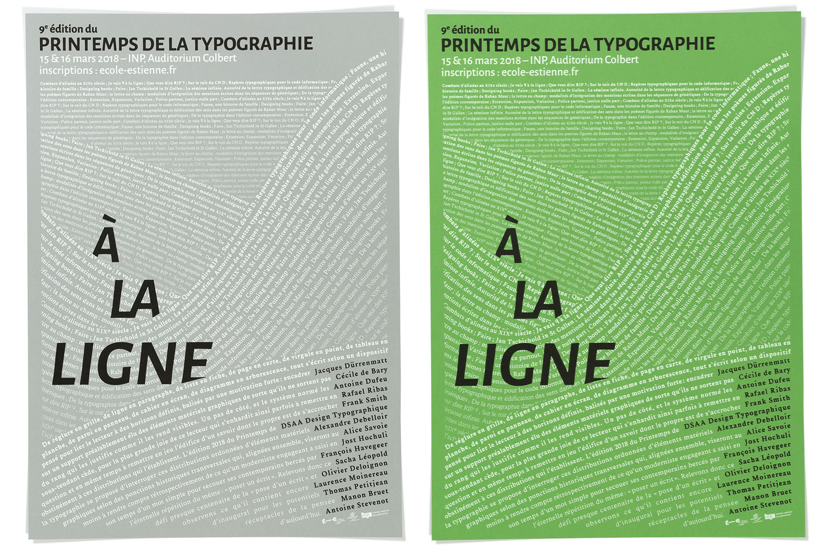
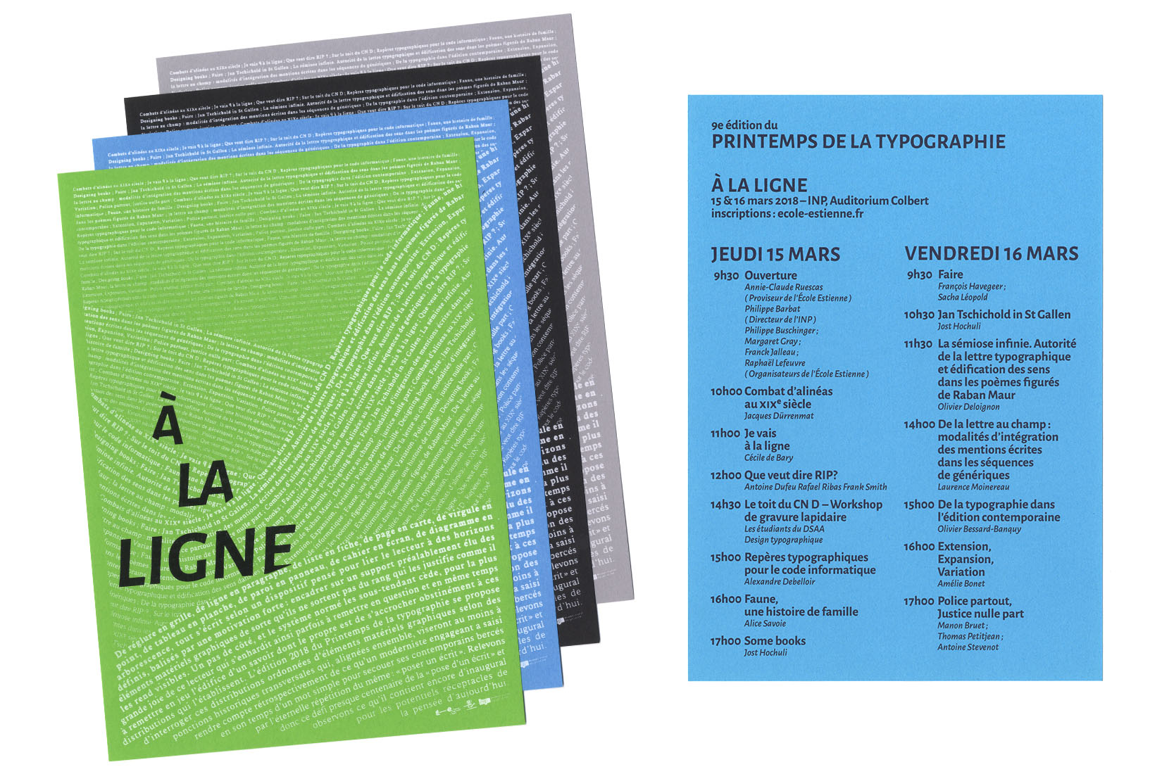
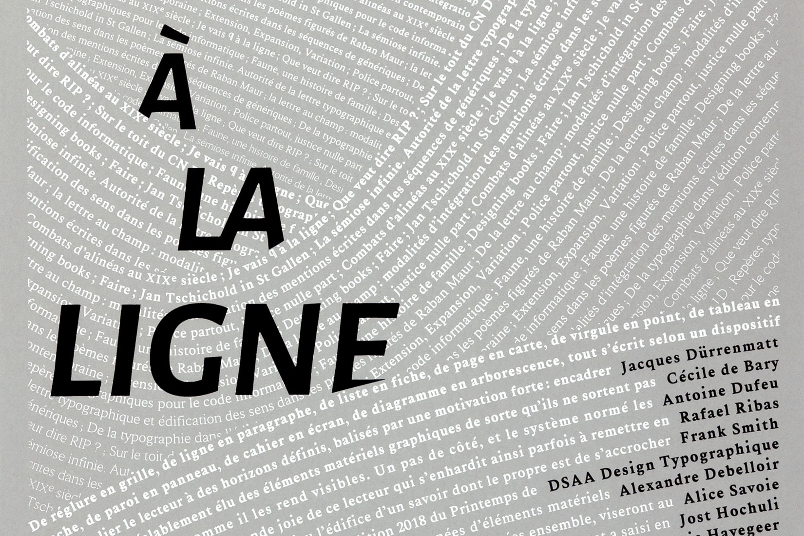
Printemps de la typographie 2018
Poster
Poster and leaflet proposal for the 9th edition of "Printemps de la typographie", a seminar focused on typography.
Screen printed on four different papers.
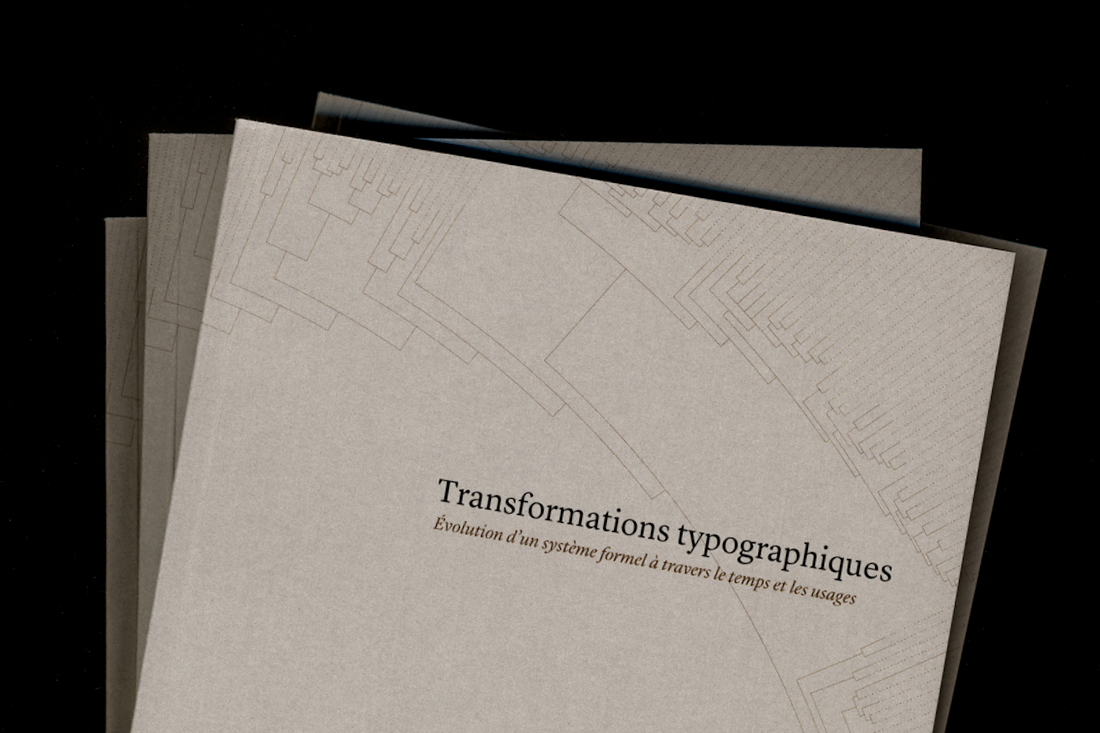
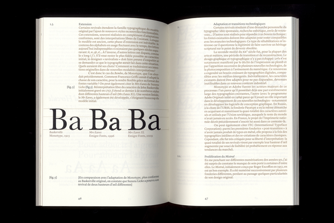
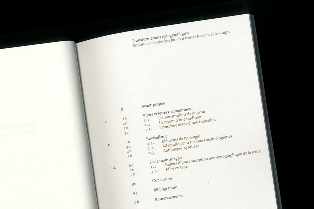
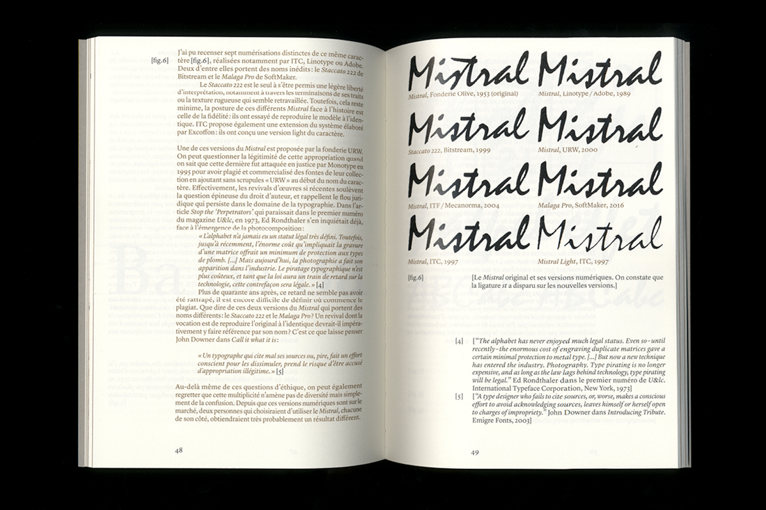
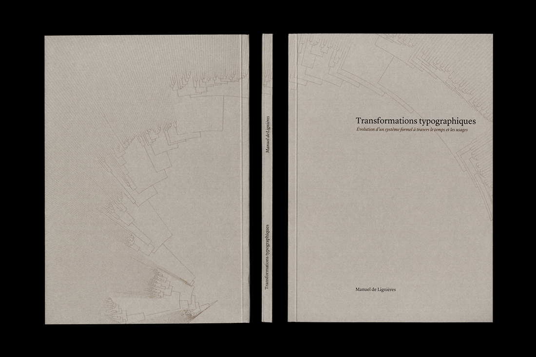
Transformations Typographiques
Master Thesis
Transformations Typographiques is my master Thesis, wrote at the end of my type design studies at École Estienne in Paris.
It is a reflection, based on my diploma project (Salmantica), about why and how could a typeface be created on the basis of various existing letterforms.
Design based on the guidelines defined by my classmates Sophie Huffschmitt, Loïc Altaber and Guillaume Goron.
manu.delignieres@yahoo.fr